Osprey migration data
Year level: 5 / 6
Strand: Statistics
Lesson length: 60 mins
In this lesson, students acquire data related to the migration of the osprey. Students represent and interpret the data, discussing and reporting on the data distribution. They compare two types of charts to decide which type is best to display the dataset.
This lesson is the second in a series of six lessons that connect the cross-curriculum priority of Sustainability, Statistics and the Science learning area: Science as a human endeavour. AC9S5H01, AC9S6H01 and AC9S5H02, AC9S6H02.
This lesson was developed in collaboration with Conservation Without Borders. Data and information provided by Tweed Valley Osprey Project.

Curriculum information
Achievement standard
By the end of Year 5, students interpret and compare datasets for ordinal and nominal categorical, discrete and continuous numerical variables using comparative displays or visualisations and digital tools. They identify the mode and interpret the shape of distributions of data in context. They compare distributions of discrete and continuous numerical and ordinal categorical datasets as part of their statistical investigations, using digital tools.
By the end of Year 6, students compare distributions of discrete and continuous numerical and ordinal categorical datasets as part of their statistical investigations, using digital tools.
Content descriptions
Students acquire, validate and represent data for nominal and ordinal categorical and discrete numerical variables, to address a question of interest or purpose using software including spreadsheets; discuss and report on data distributions in terms of highest frequency (mode) and shape, in the context of the data. AC9M5ST01
Students interpret and compare datasets for ordinal and nominal categorical, discrete and continuous numerical variables using comparative displays or visualisations and digital tools; compare distributions in terms of mode, range and shape. AC9M6ST01
General capabilities
Numeracy
- Interpreting and representing data (Level 4)
Digital literacy
- Investigating: Interpret data (Level 4)
Cross-curriculum priorities
Sustainability
- Futures (SF1)
Assessment
Have students save digital versions of their graphs to record and view their progress in use of spreadsheet software such as Excel (MS) or Numbers (iOS).
Create a class checklist to assess students’ proficiency in the use of a spreadsheet to analyse and visualise data.
Observe whether students can make relevant and accurate conclusions about the data Example might include:
- birds that have a rest break during migration have a longer journey time
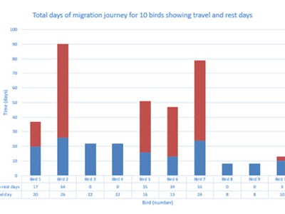
- of the 10 birds observed, 4 birds did not rest and travelled for no more than 22 days
- the longest migration time was for bird 2, which travelled for a total of 90 days including 64 rest days
- birds 8 and 9 had the fastest travel time with 8 travel days and no rest days.
Areas of challenge
Some students may:
- have difficulty transferring data in a table to a visual representation such as a chart
- have limited familiarity with working with data using a spreadsheet
- require support to interpret different charts and to choose the most suitable chart to represent a dataset.
Prerequisite student knowledge and language
Prior to this lesson, it is assumed that students have knowledge of:
- interpreting information in a table
- representing data in column graphs
- different ways to visualise data other than a column graph.
It is also assumed students are familiar with terms such as:
- position and location
- height and altitude
- migration.
Learning goals
Learning intention
- We are learning about ways to represent and report on real scientific data.
- We will use the research tasks to develop our data skills, including using a spreadsheet and creating charts.
Success criteria
By the end of this lesson, students can:
- compare and describe two types of charts to visualise data
- select a chart to display acquired data giving reasons for their choice
- visually represent and report on acquired data.
Why are we learning about this?
The work done by research teams helps us to learn more about the natural world. Using the context of contributing to a research team gathering data, we can identify patterns, analyse trends and observe changes over time. Exploring basic technologies like GPS tracking used by scientists enhances our understanding of data collection and analysis. Additionally, mastering the creation and interpretation of data displays is a crucial skill, as it allows us to communicate information effectively through visual means.
Learning hook 5 mins
- Review the fledgling data used in the previous lesson and discuss the distribution of the data for maximum altitude.
- Explain that today we will be looking at data collected showing the migration patterns of 10 ospreys over a two-month period.
Explore 50 mins
Introduction (10 mins)

Slide 3
- Explain that the osprey migration journey varies between birds. One variation is the number of rest days.
- Display data represented visually as a chart that shows osprey migration travel and rest days.
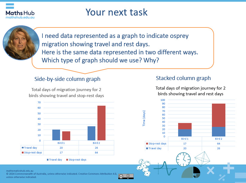
- Introduce the same data represented as side-by-side column graph and as a stacked column graph (slide 3). Discuss the similarities and benefits of both graphs.
- Points to note:
- Side-by-side column graph shows a comparison of rest to travel days side by side, however, it does not easily show the total days of the journey.
- The stacked graph shows a comparison of rest to travel days in a single column and makes it easier to see the total days of the journey. With a large dataset this type of chart can make visualising and interpreting the data easier.
Practical activity (40 mins)
- Provide students with the Osprey migration data sheet (Word), a table of data for students to investigate and represent visually. A partly completed graph is provided on the sheet. Students use the data from the table to complete the plotting of the graph. Two types of charts are provided.
- Ideally, students use a spreadsheet to organise the data and create a graph rather than to draw a graph using pencil and paper.
- For students familiar with using spreadsheets, provide the spreadsheet Osprey migration flight and rest days (Excel).
- Consider showing how to create each type of graph using teacher modelling. Use the spreadsheet Osprey migration flight and rest days-set up (Excel). This includes a chart already set up where data can be entered and the graph will auto-generate. Two types of charts are provided. Note: even after a class demonstration, some students may need further help with Excel (MS) or Numbers (iOS) to create their graphs.
- Keep slide 3 visible to support students to get started. Observe how students are approaching the task. Support them with language and enabling and extending prompts, as required.
Differentiation (support)
- How can you represent the data? How do you show this data using a side-by-side column graph?
- How can you represent the data to make it easier to interpret?
Differentiation (extend)
- How might your graph easily represent the total migration days?
- Do birds that rest more fly further than those that don’t have a rest?
Summary and reflection 5 mins
Display slides 4 and 5 and ask students to describe their findings.
- Review similarities and differences in representing data as a side-by-side column graph or as a stacked column graph.
Ask students to draw conclusions from their data? Example might include:
- birds that have a rest break during migration have a longer journey time
- of the 10 birds observed, 4 birds did not rest and travelled for no more than 22 days
- the longest migration time was for bird 2, which travelled for a total of 90 days including 64 rest days
- birds 8 and 9 had the fastest travel time with 8 travel days and no rest days.